Dashboard composition
The most useful actions appear first, with supporting details nearby.
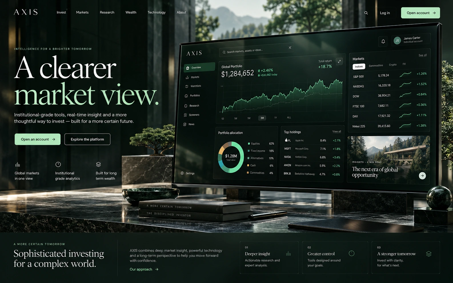
AXIS explores a finance interface where balances, activity and planning tools are organised into separate views.
The concept uses a green palette and grouped information to separate balances, recent activity and planning tools.
A responsive interface sketch. Explore the navigation and selections below. Content is fictional; enquiries, applications and bookings are not processed.
The most useful actions appear first, with supporting details nearby.
The sample figures and charts are illustrative, with labels that explain what each view shows.
Consistent spacing helps separate balances, labels and actions.
Your finances in focus
Typography and colour
used across the concept
The main colours used in this website concept.
AXIS is a fictional concept, created to explore a visual direction. Interface content and imagery are illustrative; this is not a client commission or a claim of business results.
DISCUSS YOUR WEBSITETell us about your business and what you need help with. We’ll take it from there.
info@grid24media.com